
How to Create More Realistic Genesis 9 Characters in DAZ Studio – with Checklist!
A Clean, Professional Workflow for Beginners (Without Bad Habits)
Creating realistic Genesis 9 characters in DAZ Studio is not about pushing sliders or stacking effects. True realism comes from controlled decisions, subtle variation, and understanding how the human body and skin actually behave.
This guide focuses on repeatable fundamentals that work regardless of which assets you use — and help you avoid the classic “DAZ look.”
1. Start With a Neutral, Anatomically Honest Base
Before details, your character must make sense structurally.
Refined best practices:
- Keep most morph values under 30–40%
- Blend multiple subtle morphs instead of relying on one
- Constantly rotate the character while adjusting
🔎 If a character only looks good from the front, the foundation is already broken.
2. Skin Realism Comes From Variation, Not Resolution
High-resolution textures alone do not create realism.
Realistic skin requires:
- uneven coloration
- micro surface breakup
- controlled roughness
Even a clean base skin benefits from very subtle overlays such as freckles, redness, or pore variation.
For example, lightweight add-ons like Freckles for Genesis 9 (3DShards) work best when kept below obvious visibility — they should disappear at first glance and only be noticed when removed.
That’s the correct realism threshold.
3. Imperfections Must Match the Character’s Logic
Imperfections increase realism only when they make sense.
Good use:
- faint freckles on sun-exposed areas
- subtle stretch marks on hips or thighs
- gentle redness around joints
Bad use:
- full-body heavy overlays
- uniform strength across the entire skin
- details that contradict age, weight, or lifestyle
🎯 If you can clearly “see the effect,” it’s already too strong.
4. Asymmetry Is Mandatory (But Should Be Boring)
Perfect symmetry instantly signals “CG.”
Focus on:
- slightly uneven eyes
- minimal jaw or cheek differences
- tiny mouth offsets
Even 1–3% asymmetry dramatically improves believability without calling attention to itself.
5. Materials Before Lighting — Always
Lighting does not fix characters.
It exposes them.
Before fine lighting:
- reduce excessive gloss
- avoid mirror-like skin reflections
- ensure roughness is not uniform
Then use lighting to test, not hide.
6. Use Lighting as a Diagnostic Tool
A beginner-safe setup:
- soft key light
- weaker fill light
- optional rim light
If the character fails under soft, neutral light, the problem is:
- proportions
- skin balance
- material settings
—not the HDRI.
7. Camera Choice Changes Perceived Realism
This is often ignored.
- Wide lenses exaggerate facial features
- Portrait realism works best around 85–120mm
- Always re-check proportions after changing the camera
📷 A realistic character can look wrong with the wrong focal length.
8. Fewer Details, Better Placement
Realism improves when you:
- use fewer effects
- place them intentionally
- blend them softly
A restrained character will always outperform an overworked one.
Conclusion: Realism Is Controlled Restraint
Realistic Genesis 9 characters are not built by adding more —
they are built by knowing when to stop.
If you:
- respect anatomy
- control skin variation
- embrace subtle asymmetry
- and test under neutral lighting
…the “DAZ look” fades naturally.
✅ Genesis 9 Realism Checklist (Professional & Beginner-Safe)
Use this before calling any character finished:
🧍 Base & Anatomy
- ⬜ No extreme morphs above ~40%
- ⬜ Looks correct from front, side, and ¾ view
- ⬜ Silhouette reads naturally at a distance
🧬 Skin & Materials
- ⬜ Skin is not a single flat tone
- ⬜ Glossiness reduced (no plastic shine)
- ⬜ Roughness is slightly varied
- ⬜ Any freckles / overlays are subtle and localized
🧩 Imperfections
- ⬜ Imperfections match age & body type
- ⬜ Strength is low enough to be “felt,” not seen
- ⬜ Nothing looks copy-pasted or uniform
🔄 Asymmetry
- ⬜ Face is not perfectly mirrored
- ⬜ Small differences in eyes / jaw / cheeks
- ⬜ Asymmetry does not look intentional
💡 Lighting Test
- ⬜ Looks good under soft neutral lighting
- ⬜ No blown highlights on skin
- ⬜ Form reads clearly without dramatic shadows
📷 Camera & Framing
- ⬜ Focal length between 85–120mm for portraits
- ⬜ Proportions still look correct after camera changes
🔍 Final Reality Check
- ⬜ Zoom in → skin holds up
- ⬜ Zoom out → silhouette works
- ⬜ Rotate → balance remains believable
- ⬜ Small lighting change doesn’t break realism
-
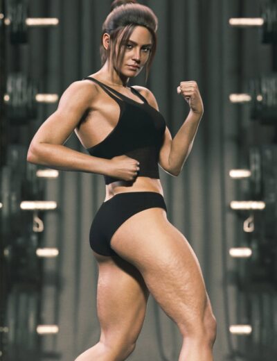 Cellulite for Genesis 99.99 $
 -
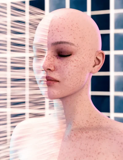 Freckles for Genesis 915.99 $
 -
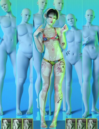 G9 Gliched Body Shapes12.99 $
 -
-
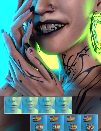
 G9 Pleaser Nail Morphs4.99 $
 -
 Stretch Marks for Genesis 912.99 $